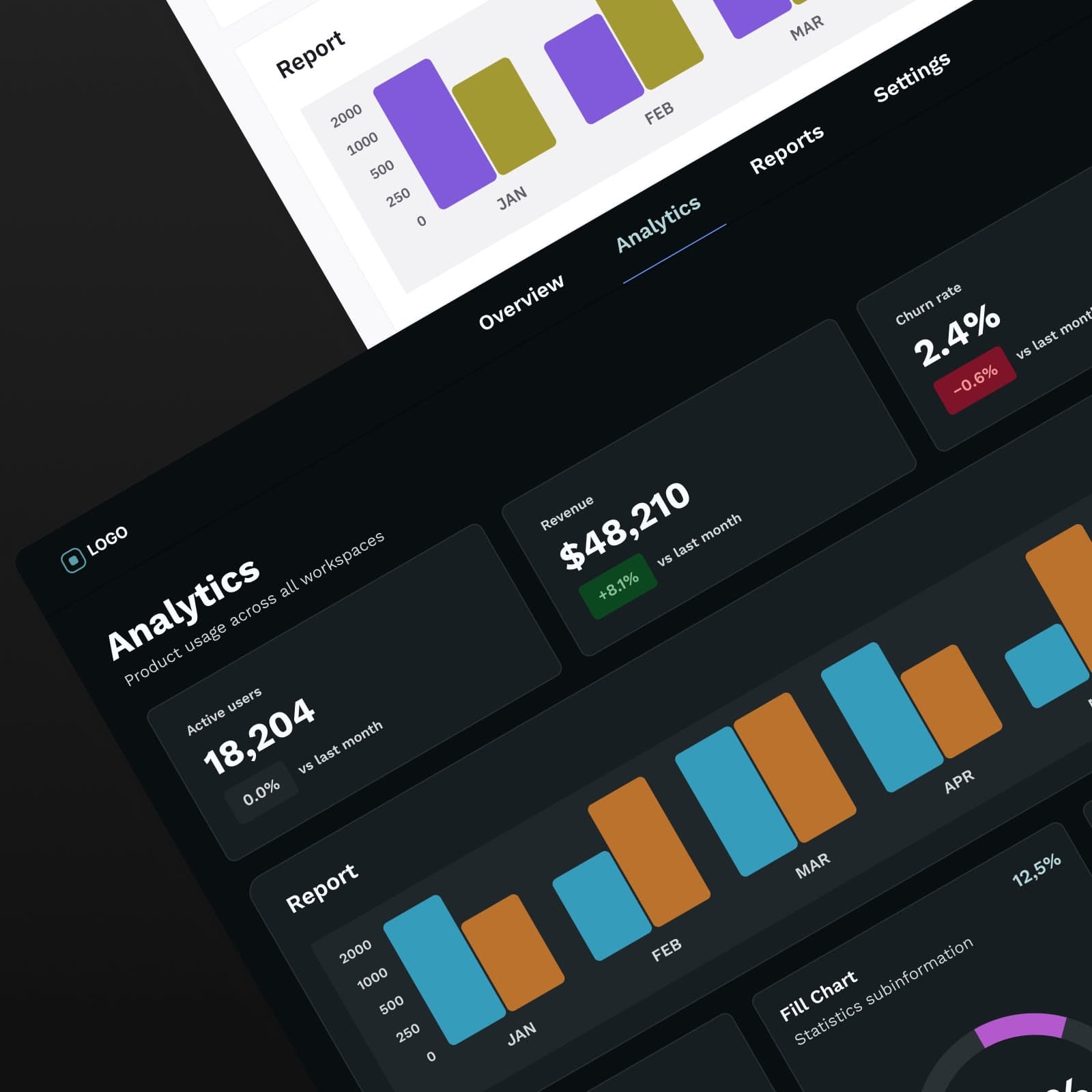
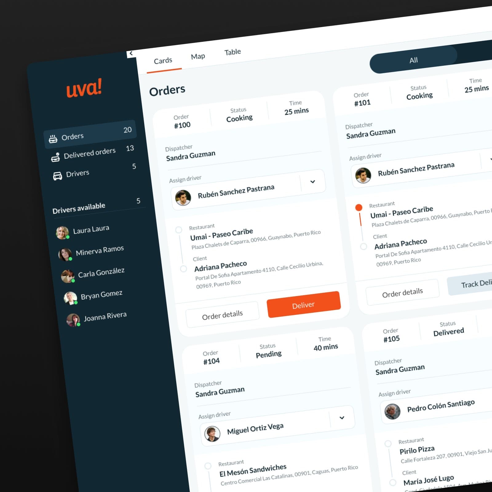
Design Systems · 2021
One shared design system that three résumé builders adopted by choice, not mandate.
- Company
- Studio, a startup inside Bold
- Timeline
- Continuous, 2021–2026
- My role
- Senior Product Designer, design system owner
- Team
- Me, one product designer, and PMs and engineers on each brand
- Platform
- Web
What this project shows
- 01
Leading a fix across three products when I owned only one
- 02
Earning adoption by choice, not mandate
- 03
Keeping three brands distinct on one shared foundation
Overview
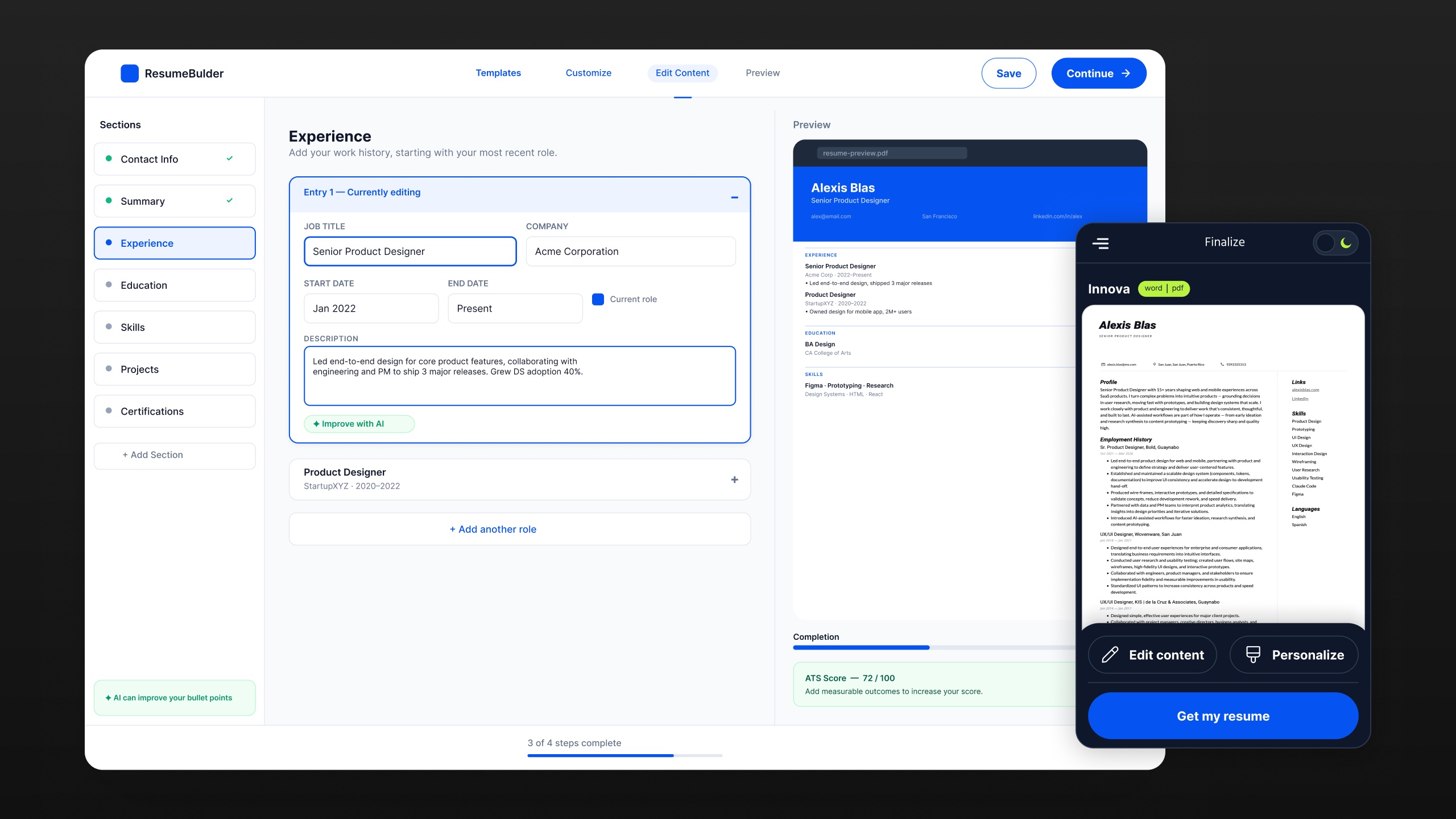
Studio, a startup inside Bold, ran three résumé builders. They grew up separately. They looked different, but they solved the same problems in different ways.
I led a shared design system that let each brand keep its look while running on one foundation. All three brands adopted it by choice, not mandate.
Challenge
Each brand had its own buttons, type, color, and spacing. Underneath, they shared the same features. That gap cost us in three ways:
- Inconsistency. Users met different patterns for the same task, which weakened brand trust.
- Slow handoff. Without shared specs, developers filled gaps with guesses, and QA cycles grew.
- Duplicate work. Designers rebuilt the same patterns in isolation.
My role
I owned one of the three products, but the inconsistency crossed all of them. I chose to lead the fix.
I started the design system soon after joining Studio and built its foundation. Then I rolled it out one product at a time, until all three résumé builders ran on it.
Another product designer with design system experience joined the effort. She took what I built, organized it, and documented it. She also built new components alongside me as we went, while I kept implementing across the brands. There was no end date. The system grew alongside the products.
I ran the audit, defined the token architecture, built the core component library, and drove adoption across teams.
Key decisions
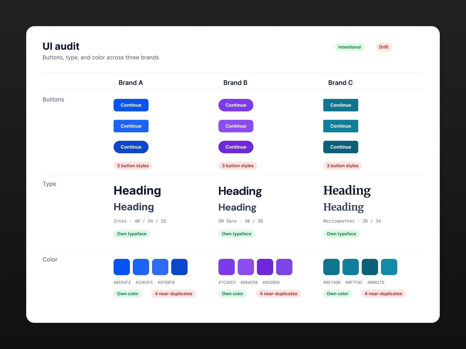
Teams worried that a shared system would flatten their brands. That concern was fair. So every decision had to prove one thing: brands can share structure without sharing a look.
Decision 01
Audit before building
I reviewed design files and live sites for all three products. This separated intentional brand choices from accidental drift.
Decision 02
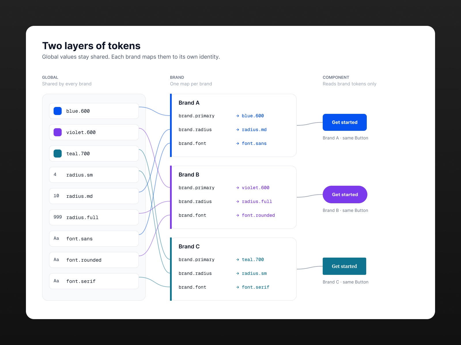
Use two layers of tokens
A global layer holds shared values. A brand layer maps those values to each identity. Brands stay distinct while structure stays shared.
Decision 03
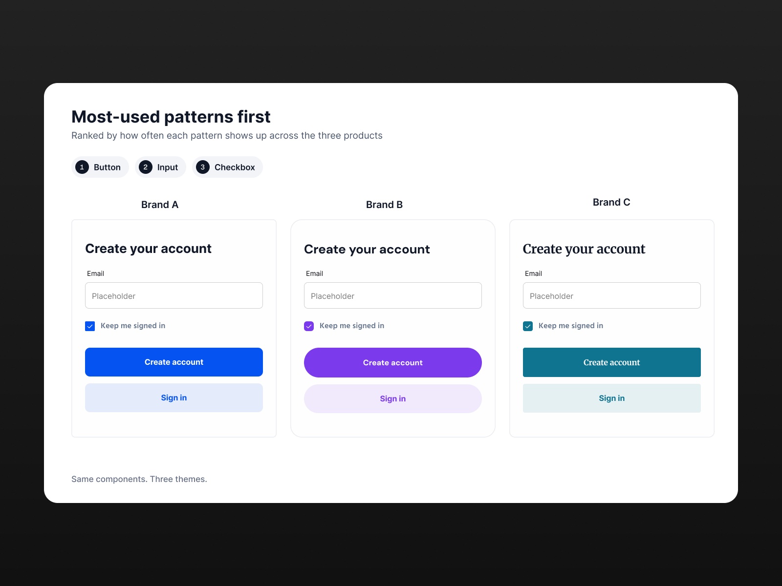
Start with high-frequency patterns
I built the most-used components first, so the system paid off early. PMs validated each one against real product needs.
Decision 04
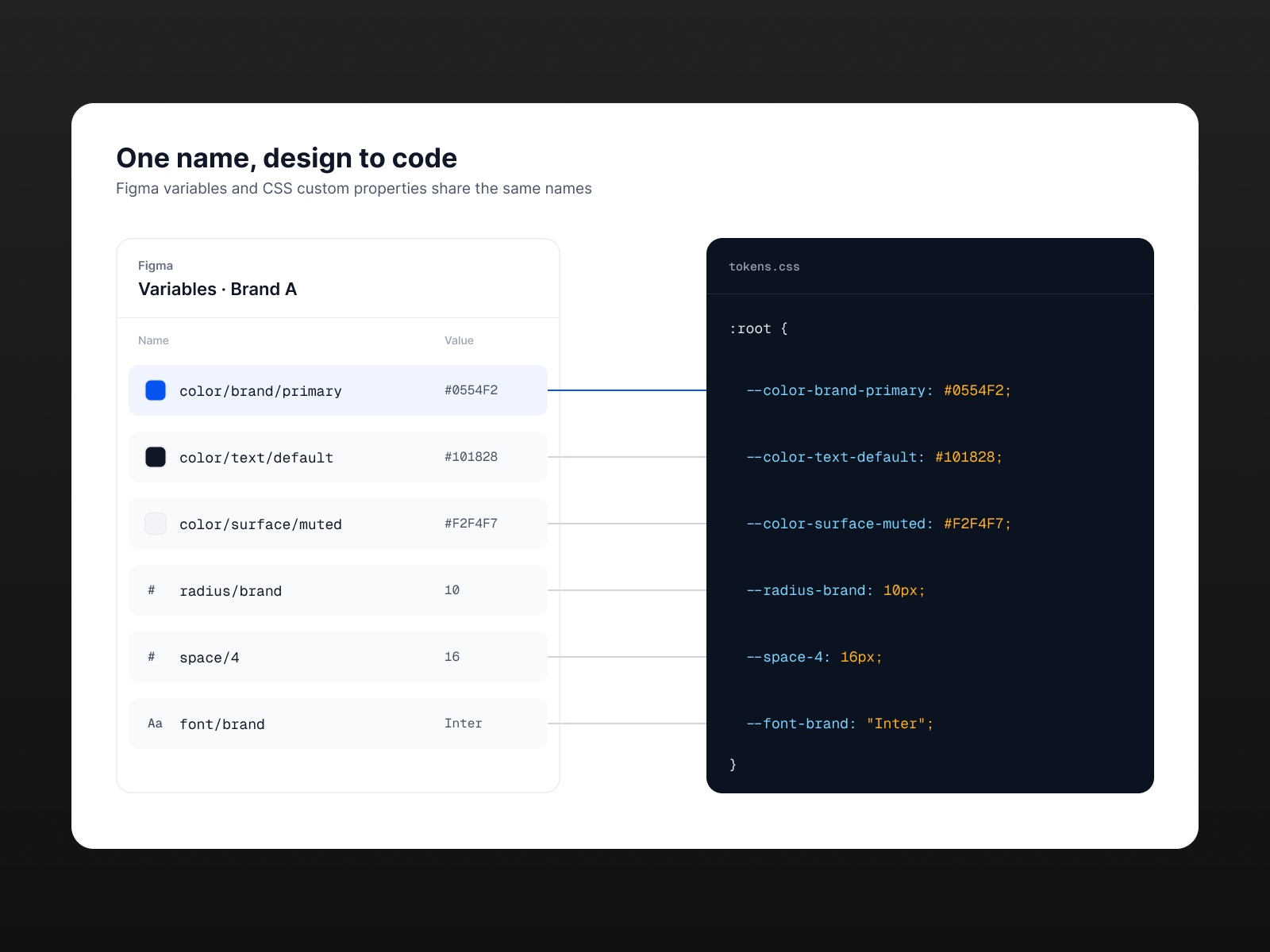
Bring engineering in early
I learned how developers worked before asking them to change. We aligned on naming in code and went after their biggest handoff pain points first.
Decision 05
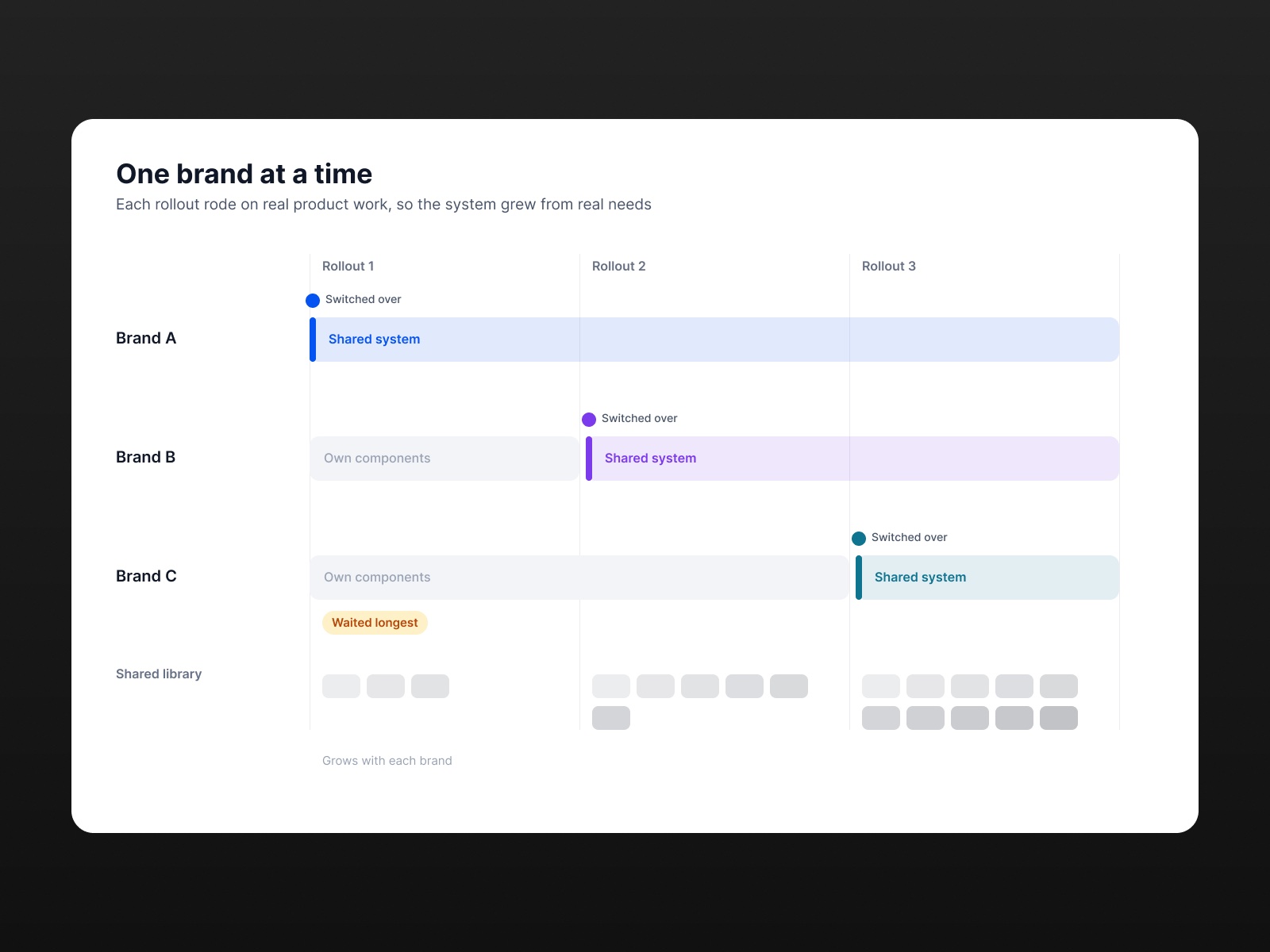
Roll out one brand at a time
Instead of switching all three brands at once, I implemented the system one brand at a time. Each rollout used real product work, so the system grew from what teams actually needed.
Trade-off: The last résumé builder in line waited longest to get the shared system.
Outcome
- Components and variants in the shared library
- 1,300+
- Design tokens across three résumé builders
- ~400
We didn't track post-launch metrics. Here's what changed for the teams.
- Voluntary adoption. Designers on all three brands adopted the system without a mandate.
- Faster delivery. Teams built from ready components and spent more time on new features.
- Better handoff. Specs got clearer, conversations got shorter, and design and code drifted less.
Reflection
The components were the easy part. The real work was with people: hearing concerns, earning trust, and showing that a shared system serves everyone.
Communication and facilitation mattered more than Figma skills.
Next projects
See all work