Product Design · 2019
From WhatsApp threads to one live dashboard: how I gave UVA's dispatchers a single place to run every delivery.
- Company
- UVA, food delivery in Puerto Rico
- Timeline
- Started in 2018, finished in 2019
- My role
- Sole product designer (freelance side project)
- Team
- 1 product manager, 1 engineer
- Platform
- Web · iOS · Android
What this project shows
- 01
Turning a messy real-time workflow into one clear tool
- 02
Changing course after testing with real dispatchers
- 03
Honest outcomes: what I'd measure, not invented numbers
Overview
UVA is a food delivery service in Puerto Rico. Its dispatchers coordinate restaurants, drivers, and customers in real time.
I designed two connected products: a web dashboard that gives dispatchers full control of every live order, and a mobile app for the drivers who deliver them.
Challenge
UVA's existing platform didn't fit how dispatchers worked, so coordination moved to WhatsApp.
Dispatchers couldn't see order status, driver location, and availability in one place. Problems arrived in chat, disconnected from the orders they affected.
The goal: give dispatchers full control of every live order, in one place.
My role
I started UVA as a freelance project before joining Wovenware, and I finished it after I joined. I was the only designer, working with one product manager and one engineer. I designed both the dispatch dashboard and the driver app. I owned lifecycle mapping, information architecture, wireframes, usability testing, UI, and specs.
- I mapped the full delivery, from order placed to delivered, to find where dispatchers act and where things break.
- I tested wireframes with 3 dispatchers before moving to visual design.
- I designed and handed off build-ready specs to our engineer.
Key decisions
Decision 01
Rebuild driver assignment after testing
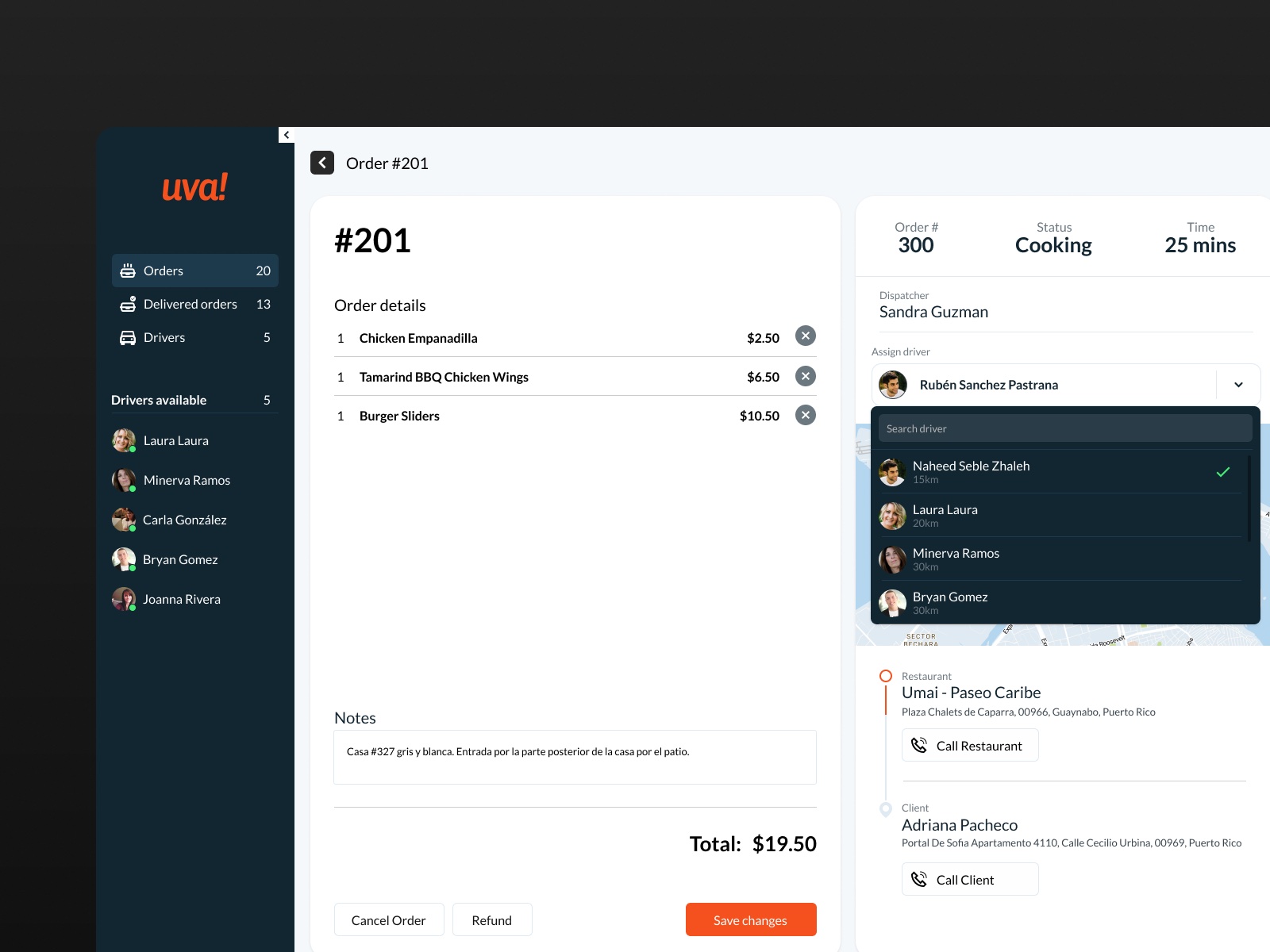
Assigning drivers is the task dispatchers repeat most. Testing showed that my first design was slow and frustrating.
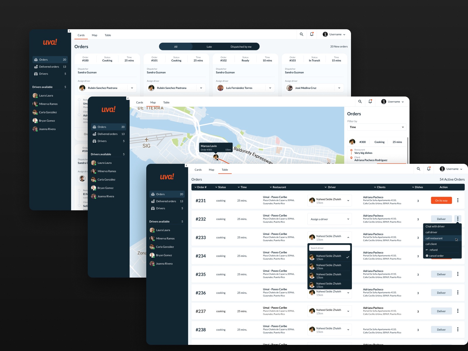
I replaced it with a searchable dropdown on each order, so dispatchers assign in seconds. Each driver shows their distance from the restaurant, and available drivers stay visible in the sidebar.
Decision 02
Three views of the same orders
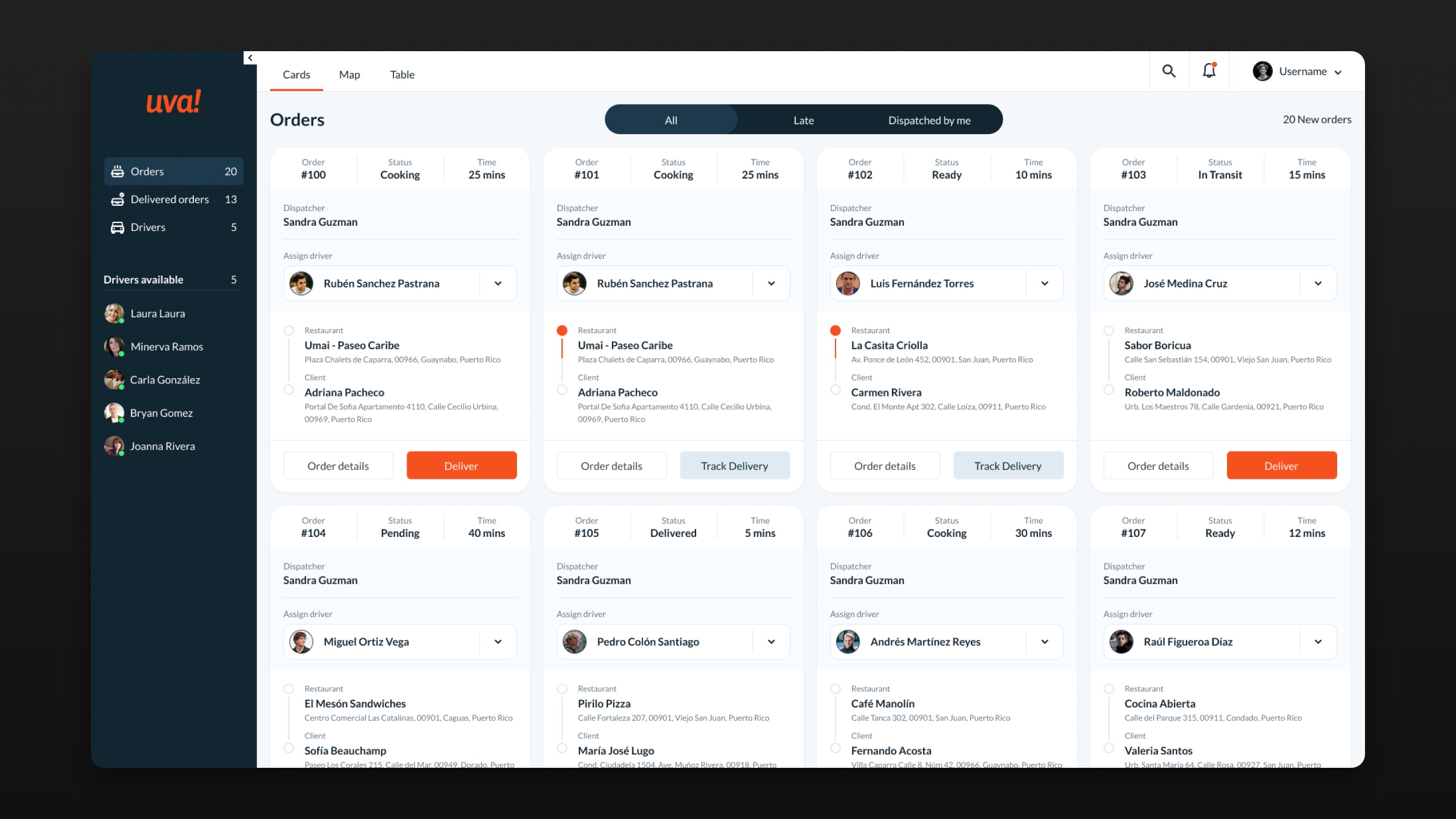
Cards for triage, Map for locations, and Table for scanning volume. Each view answers a different question, without crowding one screen.
Decision 03
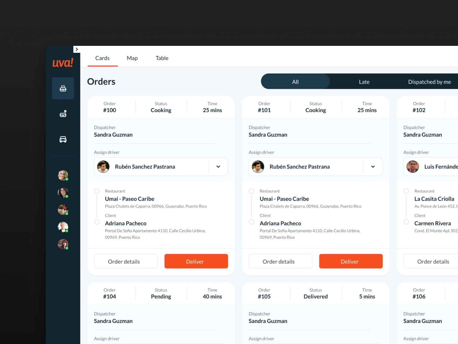
Status and time come first
Every order leads with its number, status, and minutes elapsed. A Late filter pulls at-risk orders to the top, and "Dispatched by me" shows each dispatcher their own orders.
Decision 04
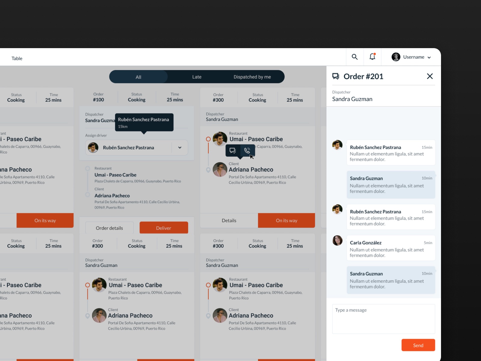
Messages live with the order
Each order has its own thread. When a driver reports a problem, the dispatcher sees it in context, not in WhatsApp. From the same order, dispatchers can also call the driver, the restaurant, or the client.
Outcome
The dashboard and the driver app were both built from my designs. I don't have post-launch data.
To measure success, I'd track three things:
- Time to assign a driver
- Share of orders that run late
- Messages still sent outside the dashboard
Reflection
My first take on driver assignment looked right but felt slow in use. Three dispatchers caught what I couldn't see alone.
Next time, I'd set success metrics with the PM before handoff.
Next projects
See all work